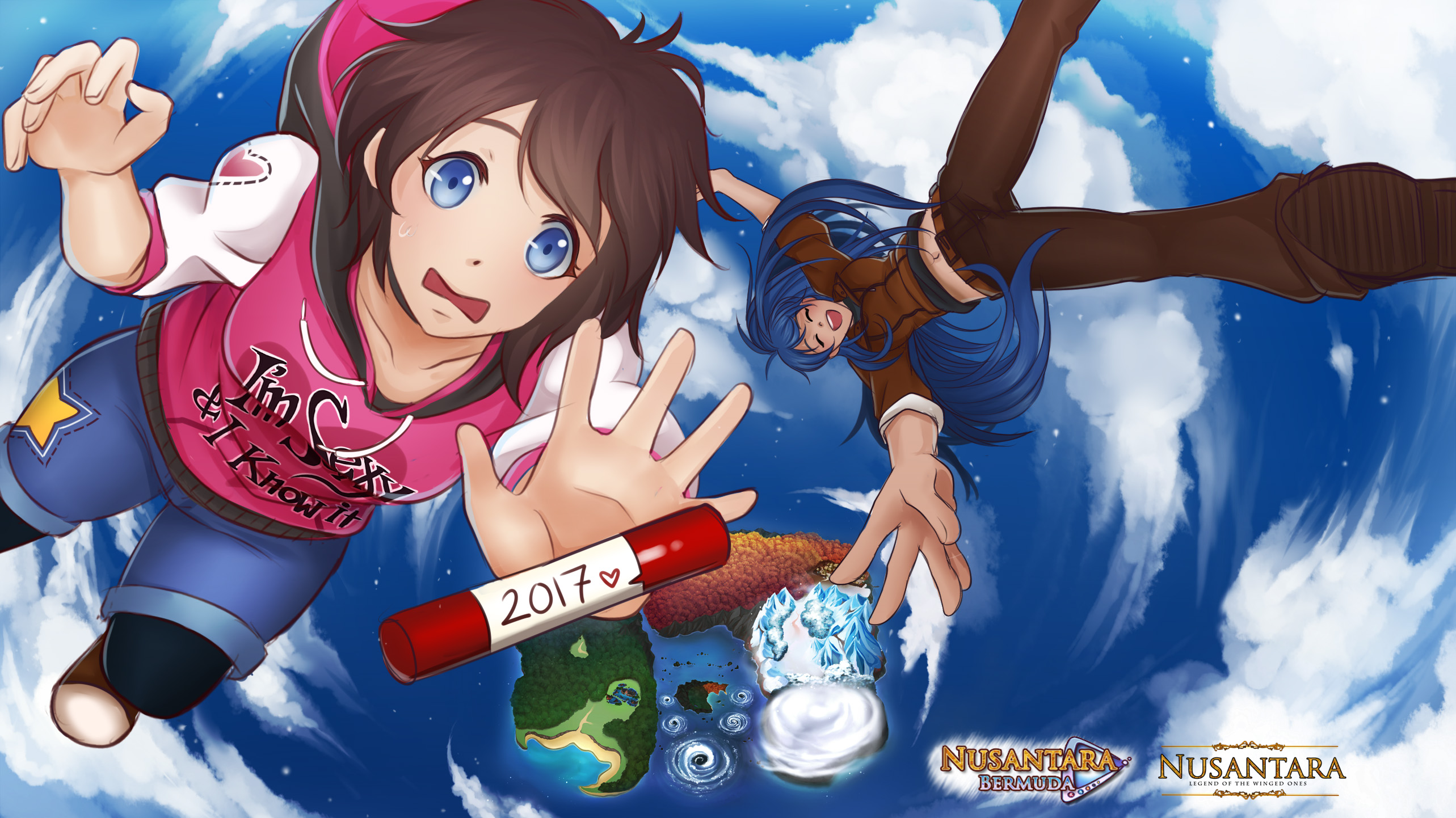
Nusantara: Bermuda Triangle
UPDATE 10/26/2020!
Hey, guys! Sorry for being late ><
I drew a lot last week and today, I was polishing up stuffs but more importantly, we're officially done with Winter Arc!
- Arya's winter CGs are done well! The total is 3 CGs + 2 secondary (secondary as in slightly different pose/effects).
It's quite smooth-sailing, but there's this one time I encountered an awkward problem where I forgot to put Maya in her winter robe ^^; because the milk have been spilled and I had no energy to re-draw it, I... decided to change the programmed scene a little to accommodate the CG OTL (forgive me).
Why didn't I have the energy to re-draw the CG you ask?
Because I've been busy drawing the Spring Village on the worldmap!
I wanted Spring Village to look colorful and festive, but it's hard to catch the atmosphere when you looked at it from above... and there are so many trees to draw my wrist hurts OTL
- After struggling, twiddling, and countless brushing up, I finally came up with 2 designs for the Spring Village!
Which one do you think looks better?
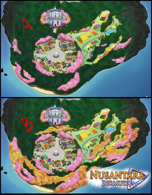
Hmm... this shouldn't count as a spoiler, right?
I mean, I've posted a sample of Spring Village's background a long time ago OuO;
Personally, I think A looks better because less detail = more focus on the village + castle, but hey! If lots of people vote on B, I'll use B! ^.^
I really enjoyed last time where you guys helped me with the blizzard effect!
I think that's it for today~
I want to rest my wrist for a couple days before I start programming Chapter 6, so see you again next week!
xoxo,
SweetChiel
-----------------------~(OuO)~-----------------------
*Taking a break with the Q&A session
I don't have the energy--all I can think about is my bed x'D
Comments
Log in with itch.io to leave a comment.
I love B!
Hello! Its been awhile since I last posted,
I think a mix between A & B would work. The yellow trees kinda off-put me as usually are the trees you have in fall, not spring. Although, I do really like this number of trees and make it look more "festive" like you wanted. Maybe change the color of the trees? I pretty much just agree w/ Yanonako's comment, lol.
I've been following your updates for probably years now, just never really commented much! Don't work yourself too hard, I know how wrist problems can be.
Hi owo! Actually, I've posted a new update and there's option C where I combine A and B so check it out ~^.^)/
And I think I remember you--your nickname is easy to remember and I want you to know that I'm grateful for your continuous support! *Hugg >\\\<
You too, take care and drink lots! My wrist is already better, hence the update + new options for you to choose x"D
I hope to see you around!
Xoxo,
SweetChiel
Hi SweetChiel, here comes the annoying one again! XD
First of all, thank you for your work and give your hand some rest! :)
To your question:
The yellow of the trees at B bothers me, because I only associate it with autumn and not spring.
That's why I think A is better, also because the focus is more on the city itself. (Which, by the way, looks great. :)) Although you could still improve this one. ;)
Here are my suggestions:
- I find the transitions from pink to green a little too hard. Or rather to see it that way everywhere. In nature, the merging of the colors is often a little softer or it seems that way. (Maybe I'm too real about it.)
- In the forest around the city I recognize about three shades of green, but none of them are a bit lighter. Here you could bring in more (lighter) green tones to loosen everything up a bit.
Once again I was free to research. ;) Here are a few examples: (Unfortunately not many to be found. -.-)
- Image 1
- Image 2
- Image 3
- Image 4
- Image 5
What do you think?
Greetings and stay healthy! :)
Hi, Yanonako! As usual, thanks for the wonderful references!
They'll do a lot of good later when my wrist is not tired and I'll polish the A background ^.^)/
I'll also try to bring more light green into the forest, (maybe it goes lighter the closer the trees are to the village?) but no promises on a detailed result (I'm afraid I'm not skilled enough to make out individual trees like your ref does :'D)
I'll post the result later, thanks again!
Ohhh... A mix between A and B would be perfect. If that's too annoying then I would choose A.
Thanks for voting, Amberbaum!
A mix between the two... as in there are only yellow flowers on the right/left side? That's a great idea! but... wouldn't that creates imbalance? >< *does this count as mild OCD? it bothers me when the yellow trees doesn't spread around x'D
I would prefer A since it's not as distracting as B, but both are rather good!
Noted! Thanks for voting, N.W.S!
I prefer B :)
Noted~ thanks for dropping by, Ennaej!
In my opinion, A looks really great. The minimal coloring of pink trees fits my vision of spring and allows me to focus on the village layout.
Although B is colorful, I was distracted by the existence of yellow trees. Are they suppose to be rare and/or special? Is the village location influenced by something, thus having yellow trees? Those were some of my thoughts.
Would the game mention in some way the reason yellow trees exist if B is to be used? I'm curious to know that.
Since I have no information on the village location, it depends if the yellow trees are part of lore or not. If they are indeed part of the lore, then B, otherwise A fits perfectly.
(when I say "part of the lore", I mean that they are part of the world lore)
Either way, both are beautiful.
Hi, darkrosen_20!
The yellow trees are not part of the lore and yes, I agree that the yellow trees are too distracting hence the voting~
I'm glad to hear you say both are beautiful tho~ my sore wrist is not in vain x'D
I think B looks Better
Noted! Thanks for voting, tis_i!