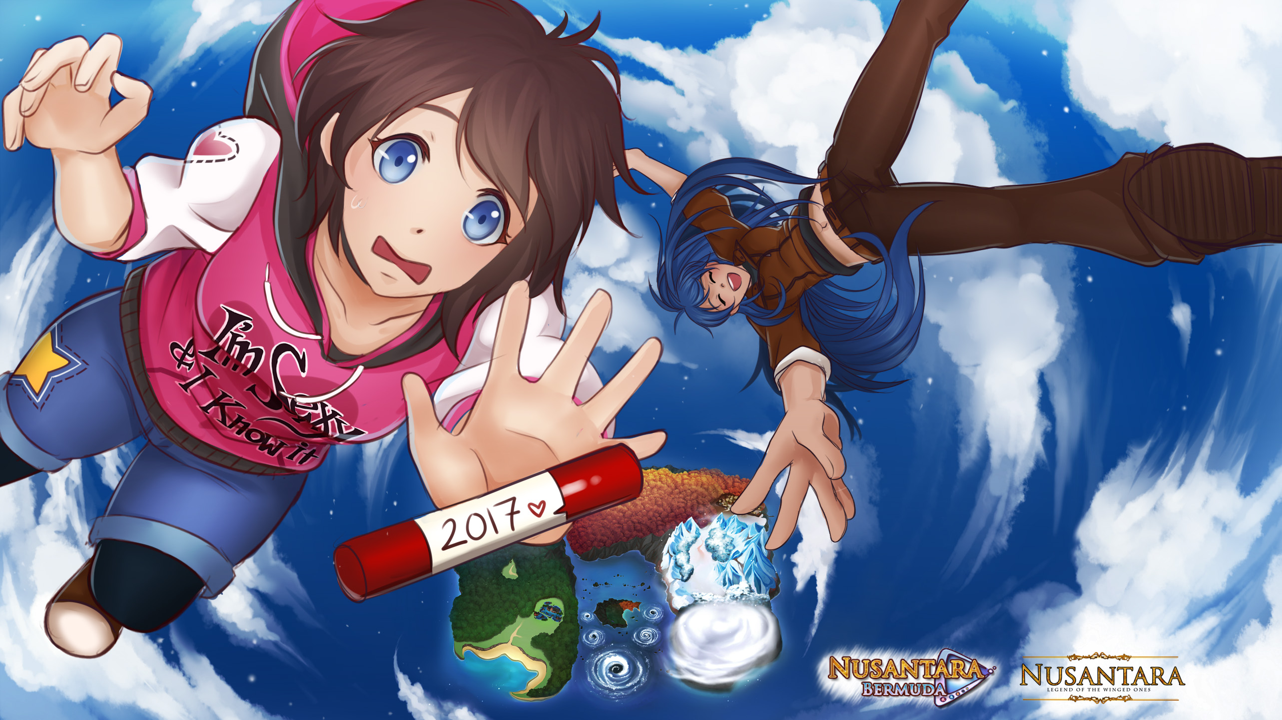
UPDATE 5/8/2023!
Hi guys! What's up? ^.^)/
How did your week go? I was pretty productive but I have good news and bad news ><
Let's start with the bad news;
1.) Nusantara Winged Ones' google play release is postponed until further notice :'(
Unfortunately, the company I'm working with, is now busy with their main project. We are a small company and there's only one programmer working on it and since the priorities changed, well... I'm afraid we'll have to wait until the programmer is free/until their main project is released.
2.) I lost the raw .psd file of the winter clothes :'(
I found everything I needed except this one. I think it got something to do with the time where I have to format my laptop. I had to format it twice in the past, remember? I still have the small sized files, the half-body sprite .png files, Unfortunately, this means I can't really give you a HD clothes showcase... if I re-size it more than 150%, the image will break Q_Q I learned my lesson from this though. Next time I plan to make an artbook, I will definitely store them in google drive!
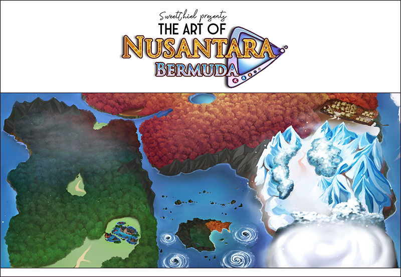
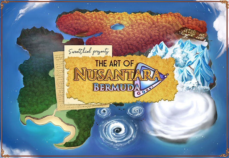
The good news is Bermuda's artbook is finally having a great progress! - After struggling with collecting materials and layout references, I narrowed down the choices and two potential front covers -^.^-
Cover A:

Cover B:

Right now, I'm leaning towards Cover B. I like the idea of a blue book very much. It's my favorite color and it shows a semi-complete look of the world map while covering just enough for mystery/to draw people in ^///^
- Currently, we're at Page 11! It covers Maya's character introduction, clothes designs, expressions sample, and CGs! I plan to do the same with the other characters. I've also started making Kahlil's character introduction. Here, let me show you where we're at:

I plan to make the pages in a simple modern style. I have lots of artbooks (both digital & physical, Japanese & American ones), and most of them also share this similar style. I guess it's more efficient this way because we want the audience eyes to focus on the images displayed?
In any case, I will definitely do my best to make a decent artbook! \(>_<)/
However, I'd like to apologize in advance. I found out that some illustrations I made is in low quality or in smaller size than the others... like the sprites expressions for example. I made the mistake of making them directly in the ingame sprite size (which is very small), I have to make them bigger and in doing so, they're a bit blurry. Sometimes, I'll have to compensate by resizing the bigger images to become smaller, I'm trying my best to find the balance but please go easy on me Q_Q I should've just make the art assets in big sizes in the first place...
With everything said and done, I learned a lot of things last week. A lot of expensive lessons. But what's done is done, I can only hope I won't disappoint you too much with my first artbook >_<;;
xoxo,
SweetChiel
----------------------~(OuO)~-----------------------
Support me on:
Patreon: https://www.patreon.com/SweetChiel
or buy me a Ko-Fi: https://ko-fi.com/sweetchiel
Get Nusantara: Bermuda Triangle
Nusantara: Bermuda Triangle
A fantasy adventure, mystery, drama & romance otome visual novel (GxB) with strong Indonesian flavour. (Not a sequel!)
| Status | Released |
| Author | SweetChiel |
| Genre | Visual Novel |
| Tags | Action-Adventure, Comedy, commercial, Fantasy, Otome, Romance |
More posts
- UPDATE 23/6/2025!Jun 23, 2025
- UPDATE 16/6/2025!Jun 16, 2025
- Saving Grace's New Gamepage + Updates!Jun 02, 2025
- UPDATE 25/5/2025!May 25, 2025
- UPDATE 19/5/2025!May 19, 2025
- UPDATE 12/5/2025!May 12, 2025
- UPDATE 5/5/2025!May 05, 2025
- UPDATE 29/4/2025!Apr 28, 2025
- UPDATE 21/4/2025!Apr 21, 2025

Comments
Log in with itch.io to leave a comment.
Definitely cover B! I love that one best!
Noted and thank you as always, princessbarb21! x'D
I also definitely love cover B. I feel like its okay for images to be small or blurry, its the process where you learn things, plus its your first one (:
Thank you, owo! Wow, cover B wins by a landslide!
Everyday I learn something new and I just noticed that if I save the artbook pages in .pngs, the images will look better and with less noises/blur, so thank goodness for that QuQ
Oooh cover B is gorgeous! I loveee artbooks, the extra and behind the scenes info on the art and creation of the game is always so fun to read about :) can't wait for everything to be ready !!!
Aww, thank you ro-ses! You're making me blush >///<
I also love artbooks! I have some collection at home, I hope I can make something as good--which is why I'll keep doing my best! Let's gooooo~
Way too excited for all of this not to comment! Cover B definitely looks better.
Also... No such thing as disappointment, because after all... YOU CAN DO IT!!!
Thank you for dropping by & for the warm support, GamingDama! ^///^
I see that Cover B is the clear winner lol, but yes, I'll do my best for you and the others!